Building a library of colours
2 part exercise.
For this exercise it is required that scenes are found where each scene is to be dominated by one of the three primary colours, Red, Blue and Yellow.
Each scene is to be photographed three times, one as the meter reading indicates as correct, a second exposure, half a stop brighter, the third exposure, half a stop darker.
Compare the three images taken, with the colour circle, and select whichever is the closest match.

Downloaded from colour vision.
The colour wheel above, is closest in colour to the wheel in OCA's building a library of colours, found in part three - Colour, The art of photography.
A colour wheel is a diagram that maps colours by their relationship to other colours on the circle. Colours related to each other are placed side by side, complimentary colours, ones that are inversely related to each other are put on directly opposite sides of the colour wheel.
The secondary colours are positioned between each pair of primary colours, these are created by mixing equal amounts of the two primaries closest to them. The secondary colour does not contain any of the colour opposite it on the colour wheel, yellow contains no blue, only red and green. The most commonly used colour wheel used by electronic devises such as computers and cameras is the RGB wheel, which creates the myriad colours required in full colour imagery. RGB, are the building blocks used in creating colour in photography.
My task in this exercise is to find the 6 colours of the basic colour wheel, and create images that are dominated by each of the colours, Red, Blue, Yellow, Green, Orange and Violet.
Producing three images for each of the 6 colours, one image as the meter reading says is correct, one where the image is half a stop brighter and the third half a stop darker. In the process I must state which is closest to the colour wheel provided.
PART 1 PRIMARY COLOURS
Hue - Red. On the warm side of the colour wheel
Is the most powerful colour, and is highly visible, being the longest wavelength. It stands out from its background and has the greatest impact when it occupies a small portion of the frame. Grabbing our attention first, it always appears to be nearest to us. Red can be any of a group of colours that may vary in lightness and saturation, the simplest colour, it stimulates and is lively and the colour of fire and blood. Also it can be perceived as being demanding and aggressive.
HSB Colour H 0 S 100 B 100
Nikon D7000
105 mm lens
Tripod
Mirror locked up
Remote cable release
Manual setting
Auto white balance
ISO 100
Hibiscus

Fig 1 f/8.0
This image shows the Hibiscus at the correct exposure. The sunlight streaming through the branches, adds contrast and creates a striking image. The well saturated colour appears bright and makes a colourful image.
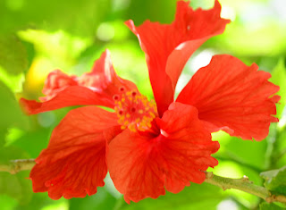
Fig 2. f/7.1
Being over exposed, creates an image with a very weak saturation level. It has changed the appearance of the colour (hue) a washed out effect with loss of detail

Fig 3. f/10.0
Under exposure creates an image of stronger colour in the upper half.
There is an increase in saturation, which causes the lower half of the image to be dark.
Blue. On the cool side of the colour wheel
Is a pure colour and cannot be created by mixing any other colours. Towards the end of the colour spectrum, and is one of the primary hues. It lies between green and indigo. The colour blue has a calming effect. Blue is also associated with fidelity, blue flowers such as violets symbolize faithfulness, it also defines our planet. Technical Information - HSB H 240 S 100 B 100
Nikon D7000
Manual Setting
Tripod
ISO 160
18 - 105 lens
Pea Flower
 |
| Fig 1. Metered Image. f/5.6 |

Fig 2. Lighter Image f/5
Loss of detail due to added light

Fig 3. Darker Image f/6.3
Yellow. On the warm side of the colour wheel.
The yellow wavelength is relatively long and therefore yellow, one of the three primary colours is the strongest colour psychologically.
Vincent Van Gogh expressed his love of yellow during a 12 month period when he complete 189 paintings mostly containing yellow.
Yellow is one of the primaries, producing a warming effect, and calls attention to itself when contrasted against a dark colour. It is the hue in the portion of the visible spectrum that lies between orange and green. For maximum impact yellow has to be of pure hue. More than any other colour it loses its power when presented as a shade or tint.
Technical Information HSB H 58 S100 B100
Nikon D7000
Tripod
Mirror Locked up
60mm lens
Manual setting
ISO 125
Shutter release cable
Rosa
+crop.jpg)
Fig 1. Metered Image. f/4.0

Fig 2. Lighter Image, created using f/3.5

Fig 3. Darker Image, created using f/4.5
PART 2. SECONDARY COLOURS
Green.
Is in the centre of the colour spectrum and is the colour of balance, life, plants and spring. It is a safe colour, used to signify anything that is natural. Green is the hue of the portion of the visible spectrum lying between yellow and blue. In photographs green has the ability to relax the viewer, but care must be taken to use other colours as punctuation in order to create interest. Green is dominant in many landscape photographs.
The human eye can distinguish more shades of green than any other colour as it is capable of a wide range of tonalities or shades.
Technical Information HSB H 120 S100 B100
Nikon D7000
Tripod
Remote shutter release
18 - 105 lens
Manual setting
Altering lightness/darkness by altering shutter speed not aperture.
Aperture remained at f/5.6 throughout, rendering background out of focus.
125 ISO
Weathered figurine in my garden in France, weather and the elements change the colouring on this figurine, I see many variations of green in Figure 1. An abundance of algae gives each image a green/yellow cast.
I chose to alter the shutter speed on these images to experiment to see how the varying amounts of light would alter the value of the colour or its saturation.
Figurine
Base+green.jpg)
Fig 1, Metered Image 1/15 sec.
+Darker+Green.jpg)
Fig 2. Dark and underexposed image 1/30 sec
As there is less light in this image I see less varieties of green, and I can see shades or hints of yellow.
Lighter+Green.jpg)
Fig 3. Overexposed image 1/10 sec
No longer pure greens, secondary colour yellow is visible.
Orange- on the warm side of the colour wheel.
A combination of red and yellow. Being a combination of the two colours it tends to inherit the characteristics of both red and yellow, but with less intensity. Orange can be any of a group of colours red and yellow in hue, of medium lightness and moderate saturation. It is a fun colour, associated with happiness and sunshine.
Below are my three images taken in the garden here in Oman. They show the newly formed petals of a Bougainvillea, which begin life as seen below, a deep Orange in colour which over a period of time will revert to their true colour of rich Cerise Pink in a couple of days.
Technical information HSB H 30 S 100 B 100
Nikon D7000
Micro Nikor 60 mm Lens
Tripod
Shutter release cable
Manual setting
1/500 sec
ISO 100
Bougainvillea

Fig 1. Metered Image. f/5.6

Fig 2. Lighter image. f/4.5

Fig 3. Darker Image. f/7.1
Violet- is a secondary colour formed by mixing blue and red, with yellow as its complimentary hue. It is the opposite end of the spectrum to red. It is not a colour that is readily found in nature, though of course the flower of that name is an exception. Violet is a colour that is traditionally associated with nobility and conveys a feeling of elegance and warmth.
Technical Information - H- 273 S- 100 B-100
Nikon D7000
60mm lens
Manual setting
Tripod
Shutter Release cable
I have selected the three images below as I see violet at the heart of this flower and running through the veins, which create a delicate design.
The analogous colour scheme of this Petunia flower are adjacent to each other on the colour wheel, therefore creating an image that is very rich in colour. It lacks contrast as it is not as vibrant as a complimentary theme.
Petunia
Copy+VioletF5.6CROP.jpg)
Fig 1. f5.6 ISO 250.
Overexposed image, the centre of the petunia, appearing to be more on the blue side.

Metered Image. Fig 2. f7.1
The centre of the Petunia, is closest in colour to the Violet on the colour wheel.

Violet+copyF9+CROP.jpg)
Fig 3. f/9.0
By closing down the shutter speed, less light has been able to get through, rendering this image dark, the veining, nearing its primary colour of blue and at the centre and towards red on the petals.
No comments:
Post a Comment