Colour is the perceptual characteristic of light described by a colour name. Specifically colour is light, and light is composed of many colours. Those we see are the colours of the visual spectrum, red, orange, yellow, green, blue and violet. Objects absorb certain wavelengths and reflect others back to the viewer. We perceive these wavelengths as colour.
Colour relationships are bought together here, in the contexts I have explored in Colour.
The brief is to create four photographs using found situations and still life arrangements which demonstrate the relationships between colours:
- colour harmony through complimentary colours
- colour harmony through similar colours
- colour contrast through contrasting colours
- colour accents using any of the relationships
I am required to comment on the colour relationships seen in each image.
Most of the images in Assignment three have be taken during the past 3 months, whilst I have been away from Oman. London, West Wales and France, the three main areas I had to visit during that period. It was my aim during this time to find when possible possible images that were of natural colours, not paint colours. It was extremely difficult, having accumulated several sets of images throughout this period, which I could browse through on my return home.
Also it was my aim to 'make' a photograph and not just take a photograph.
All the images except for Fig 14. were taken with my Nikon D7000, using a variety of lenses. The photograph that was not taken with the Nikon was taken with the new Samsung Galaxy Camera.
Colour harmony through complementary colours, any two colours on opposite sides of the colour wheel. Complimentary colours bring out the best in each other. When fully saturated compliments are bought together, and interesting effects can be seen.
Every colour on the colour wheel has an opposite, a colour wheel opposite as well as a perceptual opposite.
Complementary colour relationships are blue-orange: red -green and yellow-violet
Every colour on the colour wheel has an opposite, a colour wheel opposite as well as a perceptual opposite.
Complementary colour relationships are blue-orange: red -green and yellow-violet
REFLECTIVE THOUGHTS

Fig 1.
F/4.0. 25mm. ISO 125 1/40 sec
Manual mode.

Image by Tom Wood - Bus Odyssey collection
An evening stroll through London, capturing reflections in windows. Following my recent visit to The Photographers' Gallery in London, where I visited the exhibition of Irish photographer Tom Wood: Men and Women and Bus Odyssesy. Fascinated by his images of the reflections and views seen from and into bus windows around Liverpool and Merseyside. I chose to look at reflections in shop windows, within the locality of the gallery, just off Oxford Street, and include this image of the reflection of blue lights at Christmas seen through a shop window, the two contrasting hues are delicately pale. Both the blue and orange create a calming effect, set against the darkness of night and the finished image highlights colours on the warm side of the colour wheel.
The blue is more dominant in this image, I feel this is because it is in the foreground of the image, and also behind the model in the advertisement.

f/6.3. 60 mm lens 0.77 sec. ISO 160.
Manual mode. Tripod
Abstract / macro flower study, focusing on the heart of the flower and rear stamens, with the smatterings of pollen on the petals which radiate from the centre. The very shallow depth of field, renders the edge of the frame to be out of focus. My camera positioning was critical, positioning my camera parallel to the centre of the subject. I have chosen this image to highlight the wonderful complimentary colours, indigo and yellow. There is colour contrast in this image also, orange and yellow are spaced a third apart on the colour wheel.
I had to cut this flower and work indoors, as the slightest breeze outside, rendered my attempts unsatisfactory. I placed the flower in bright sunlight to achieve this image and to capture the contrasts and saturation of the colours in this study.
I had to cut this flower and work indoors, as the slightest breeze outside, rendered my attempts unsatisfactory. I placed the flower in bright sunlight to achieve this image and to capture the contrasts and saturation of the colours in this study.
ANCHORED
colour+harmony.jpg)
Fig 3.
f/5.0. 1/1250 sec. ISO 125. 40mm
Manual Mode.
The shank of an anchor, used by local fishermen, deeply buried in the hot sands. Weathered and eroded by the winds and humidity. Complimentary colours, Orange and Blue, contrast with the rigid stem of the anchor and the softness of the moving fabric wrapped around the anchor ring, in place to protect the hands of the fisherman.
The circular shape of the ring, compliments the twists and turns in the knotted rope. The stillness of the anchor is in contrast to the slight movement in the net like fabric being blown by the gentle breeze off the ocean.
The blue sky in this image is very overpowering, but with the darker blue of the knotted rope, sitting along side the angle of the anchor, adds balance. Very often in Oman the skies are a blown out white from the intense heat, but on this shoot the sky was as seen, a glorious blue which complimented the orange on the cloth and in the rust of the anchor.
The blue sky in this image is very overpowering, but with the darker blue of the knotted rope, sitting along side the angle of the anchor, adds balance. Very often in Oman the skies are a blown out white from the intense heat, but on this shoot the sky was as seen, a glorious blue which complimented the orange on the cloth and in the rust of the anchor.
MOTION

f5.6. 2.50sec. 92mm. ISO 125
Manual mode
In London, surrounded by colour and light, from decorative lighting for the season of Christmas, I spent a short while out at night, trying to be a little creative, by intentionally creating motion in lights. By using F/5.6 aperture and restricting the amount of light entering my camera,this rendered the background black which in turn bought out the brightness and reflectivity of the coloured globes. The result as seen in fig 4 is very subtle and highlighting the contrasting colours as seen.
Colour harmony through similar colours, Colours which are next to each other on the colour wheel are seen as being similar. They can give a pleasing and harmonious effect. Blues and greens, (cool) effect, reds and oranges (warm) effects.
CAFE ZIK
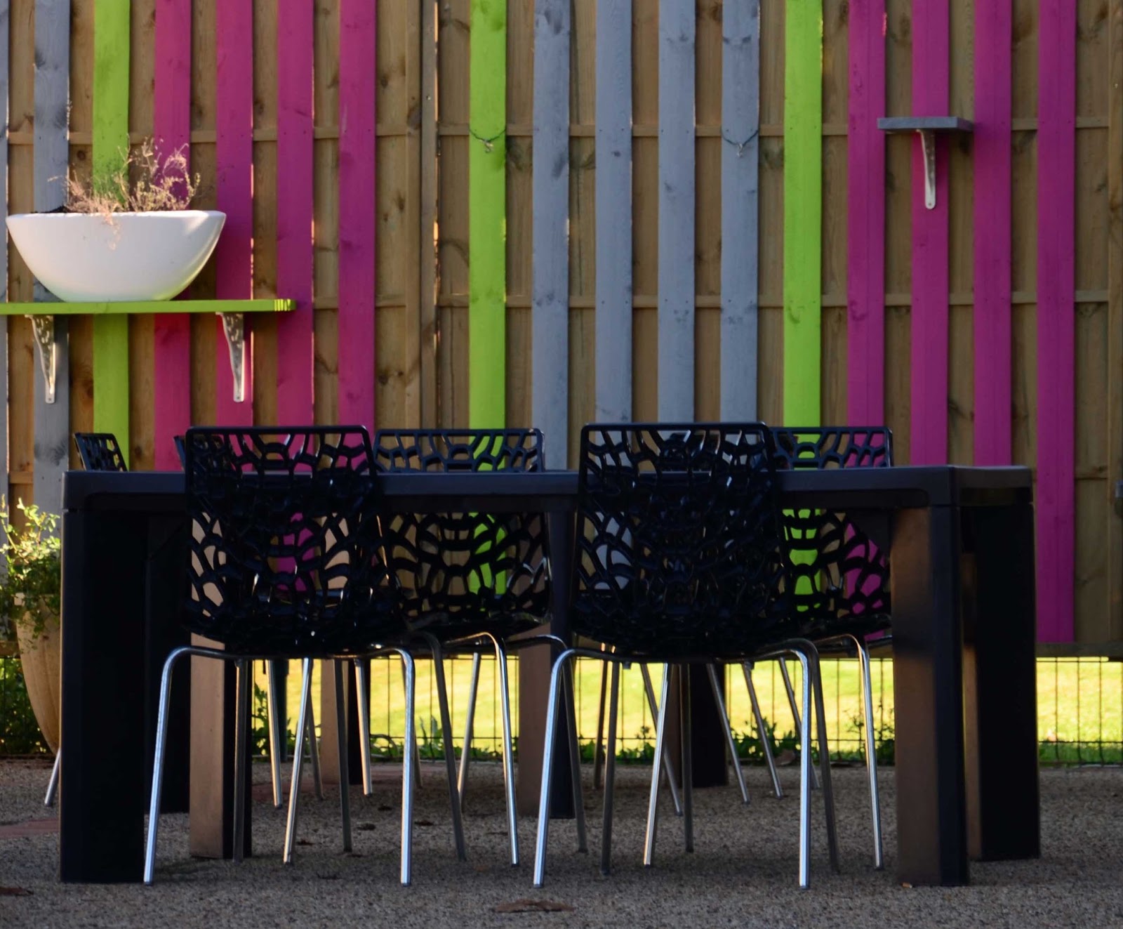
Fig 5.
Manual mode. f/5.6. 1/50 sec ISO 100.
Tripod.
Manual mode. f/5.6. 1/50 sec ISO 100.
Tripod.
Outdoor eating in Marciac, on the edge of the Lake. Empty seating awaiting diners in delightfully decorated surroundings. The painted boards, compliment each other and the colours work in harmony together in blocks of primary colours, separated by a single green board, a secondary colour. It is the green that is dominant in this image,due to its vibrancy, and clashing with the red, which is usually the strongest colour, but in this image vibrancy. This has less visual effect in the image, I believe because it is placed between the two vertical lines of green..
VILLAGE COMMUNICATION

Fig.6.
f4.2 1.60sec ISO 400 18-105 lens.
Manual Mode
Taken in the rural community of Tregaron, in West Wales, this phone box is a dominant fixture in the centre of the village square. Paintwork is showing signs of neglect, whereas the building behind has been refurbished in recent weeks.
Image 6 was taken in Raw format and converted to Jpeg. Cropping was used to remove a post in the foreground of the image. The red of the telephone box is a very dominant colour, and dominant also by being at the front of the image, and is much brighter than the pale hue of violet, which is muted. The red occupies a slightly larger portion of the image. A simple image, highlighting simplicity in traditional village life.
In this composition there are many lines horizontal, vertical and curved, in both telephone box and on the shop front, archway and street lighting. The cobbled path add other interest to the viewer.
In this composition there are many lines horizontal, vertical and curved, in both telephone box and on the shop front, archway and street lighting. The cobbled path add other interest to the viewer.
EARTHENWARE

f/14.0 10/400sec. 75mm. ISO 100.
Manual Mode. Tripod
A collection of garden pots, most in an unglazed state, all weathered from being outside and baked in the sun. Analogous colours red and orange, on the warm side of the colour wheel, are seen. The contrasting blue pots reflect the warmth of the orange/red from the neighbouring pots. Similar colours throughout this image from the darker tones of the pot at the foreground to the lighter hues of the pots at the rear, which have a blown out effect from the sun.
COLOUR WHEEL

f/29. 100/10 sec. ISO 200. 40mm.
Manual Mode
Tripod.
An image taken in 2012, specifically for the assignment Colour. My interpretation of the colour wheel, showing each colour from yellow round the colour wheel to green. The Ferris wheel is a monochromatic colour scheme highlighting variations in lightness and saturation of the colour blue. The monochromatic scheme is easy on the eye as it is blue.
The carousel in the foreground shows an analogous colour scheme, Orange and yellow, red and orange, each adjacent to the other on the colour wheel. Yellow is the dominant colour, the other colours enrich the scheme.
Colour contrast, through contrasting colours
NIBBLES

Fig 9.
f3.5. 1/50sec. ISO 200
60 mm lens
Manual mode
Tripod and remote shutter release
This very popular brand of snacks were found in my local supermarket. I rotated them to show the Arabic text, for added interest. Both tubes were parallel to each other but the red tube is far more dominant due to its colour than the green, giving the impression that it is standing forward to the green, this was not so.
MIXED PRIMARIES

Fig 10.
f/11. 1/100sec. ISO 400.
105mm
Manual Mode
Flash
Tripod and remote shutter release
Creating this image was fun as I wanted to create an artistic image, using the two primary colours, spaced a third apart on the colour wheel alongside the secondary colour found between the two primary colours. I wanted some of the periphery of the image to be soft and slightly out of focus which I achieved. The curves of the pencil sharpening have a relationship with the curves of the pencil colours. Red appears in the image, although very weak in depth of tone.
ANCIENT and UNLOVED
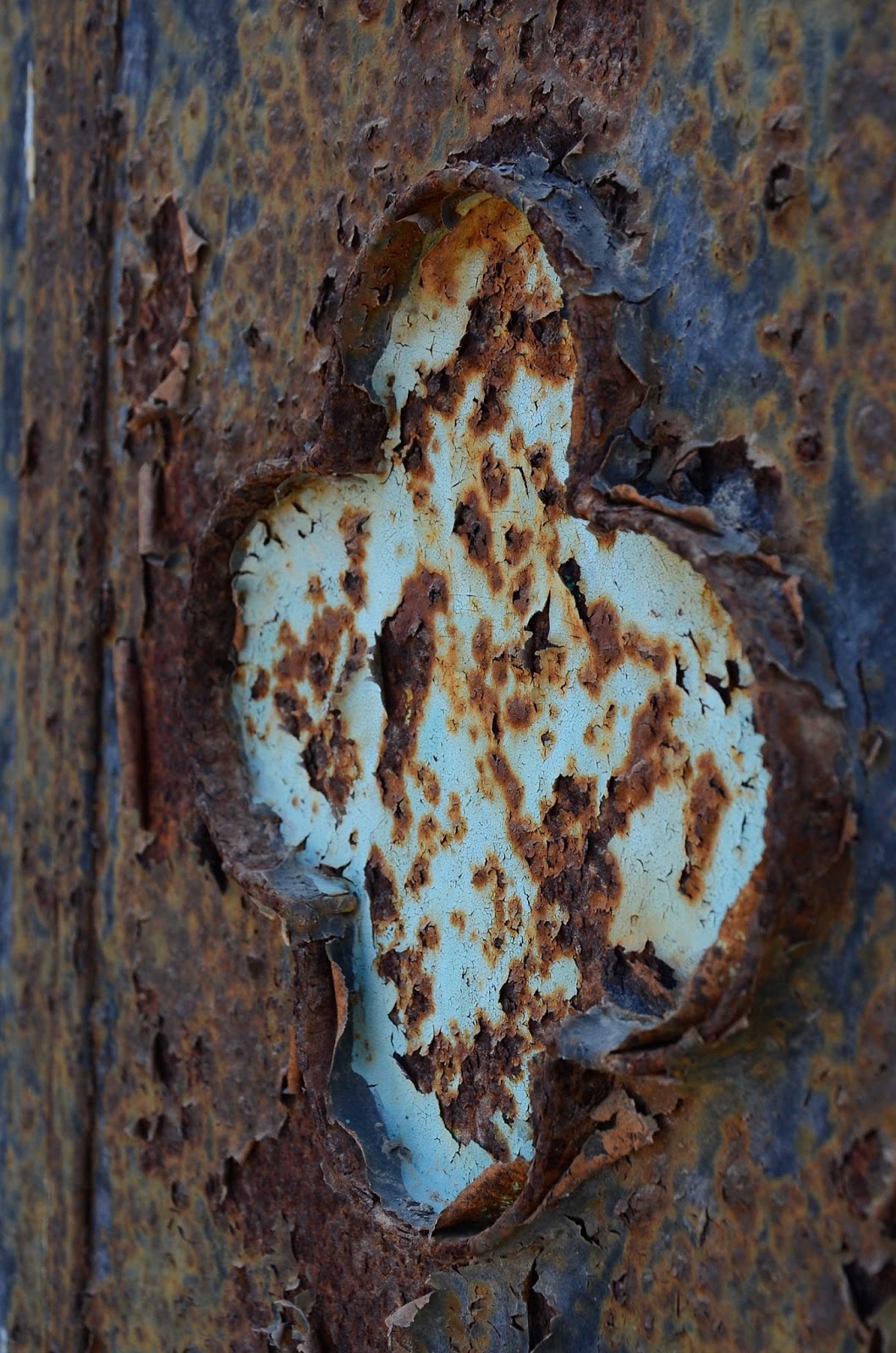
Fig 11.
38mm 1/400 sec f/9.0
ISO 125
Manual mode
Tripod
A very small part of neglected metal doors that stop one from entering a derelict living space along the beach front in Sohar. At one time many years ago, very much loved as each embossed area is painted in a selected different colour. Over the years the corrosion has set in, sea air, heat and winds have corroded the metal and caused the paint to peel and metal to rust. These solid metal doors are seen on most entrances of homes where there is an outside space, some loved and cared for others left to the elements. The curling paint, held in place by the eroding rusting metal which has turned to a Burnt Umber with age and looks rough in texture. Seeping through also the pale blue area and the small areas of Sapphire blue cling on to the eroding metal. There are equal amounts of Sapphire blue and Burnt Umber in this image, with the paler tint of blue creating an accent colour, even though it is not a solid block.
The two root colours or hues seen in this image are Orange and Blue.
FAÇADE
Blue+and+Red+colour.jpg)
Fig 12.
f5.6. 10/300 sec. ISO 100. 85mm.
Manual Mode.
Stunning architectural design on façade of building in Lourdes, France, I believe it to be a hotel.. The blue, white and red are the colours of the French Flag which is known as Le (Drapeau) Tricolore, in French. The three colours have a great significance in France, the blue colour is associated with caring for the destitute by the affluent. The white colour stands for peace and honesty and for royalty and nobility. Finally the red colour is associated with Saint Denis, the patron saint of France, who was beheaded for his preachings.
The red and blue are two of the three primary colours on the colour wheel, they are placed equidistantly around the circle. Red is usually a very stimulating colour but here it is less so, due to the dominance of the blue. The two colours are separated by the white or natural stone, this enables the viewer to look at the red and blue as two separate colours.
Colour accent using any of the colour relationships.
KEEPING FIT

Fig 13.
f/10.0. 66mm. ISO 125.
Shutter Priority.
The exercising of prize bulls is a daily sight here in Sohar, each morning they are bought to the beach in open back trucks and led to the sea where they are exercised in deep water. The Omani believes it strengthens them and cures ailments and skin problems.
The colour relationship here are the two complimentary root colours or hues, Orange and Blue. The bull being large enough in this image to create a bold block of accent colour. The size of the animal is slightly overwhelming in this image but the Omani man adds balance to the photograph.
RED FOR DANGER
crop.jpg)
Fig 14.
f/4.0. 1.320 sec. ISO 100. 20.3 mm
STITCHERY
 Fig 15.
Manual mode. 10/13 sec. f/3.7. ISO 320. 105mm lens.
Tripod and remote shutter release

Reflections on the assignment - Colour
This was an interesting and yet very difficult assignment for me to complete, due to personal difficulties. Taking into consideration the fact that I wanted to 'make' and present interesting photographs for this piece of work, I feel that one or two of my perceptions of colour relationships may not be up to standard, or correct!! Who is to say if a particular colour relationship works, I believe that each viewer will see the images in different light and each have differing opinions. Rules are made to be broken. Looking over the work I have achieved to date I have used what I have learned in respect of graphic elements, colour and design to put this work together, I have tried to incorporate all that I have learned in this assignment. Through this piece of work I have come to understand light and colour, and find that I am very attracted to the light at night in particular. When in London I found that walking the streets at an unearthly hour of the morning, delightful, I was not shy of using the camera and tripod on what could have been a very busy time in the city. I shall be venturing out again in the early hours, very soon........Maybe to put some work together for Assignment 4.
f/4.0. 1.320 sec. ISO 100. 20.3 mm
On this particular day I was lunching in my local village of Maubourguet, after returning from a short trip to the mountains. I had with me only my Samsung Galaxy camera, which I used to take this image. My initial purpose was to capture the unique way the trees are trained to create a canopy across the road, not intentionally concentrating on the red van. In the summer months this is a beautiful green canopy which I drive through to reach town. It was whilst searching through my colour images for this assignment, the red vehicle caught my eye, the van adds a definite accent colour (red) to the scene which I see as an overall 'blue' scene.
STITCHERY

Manual mode. 10/13 sec. f/3.7. ISO 320. 105mm lens.
Tripod and remote shutter release
A still life, showing another passion of mine, embroidery. I chose to use my Macro lens, as I wanted to concentrate on two elements in this image. The variations of the colour Green and the accent colour of Yellow on the scissor handles. The various greens highlight the monochromatic relationship that are shades and tints of the same hue.
I opened up the ISO for this image, as I working away from light, this enabled me to work without the flash and the colours of the embroidery silks are true to colour. The brightness of the accent colour is enhanced by the higher ISO. The accent colour offers a contrast, due to its vibrancy and intensity, even though it only a small proportion of the image.
ST CHRISTOPHER'S PLACE, a gem, London

Fig 16.
f/5.0 0.4 sec. ISO 125. 58mm - 18-105 lens.
Manual mode.
I was in London, the week before Christmas, and can across this photo opportunity when out and about very late one evening. I instantly saw the potential of an image for this this assignment. Today I have deliberated as to which category to place it. I have decided to use the image in this section, Colour accent... as I wish to highlight the Red reflection in the lower corner of the photograph. Some viewers of this may suggest that the figure should be the accent colour, I feel that is too obvious.. The H&M reflection is from a shop display to the right of the alleyway, the walls of the alleyway are also reflected in the large glass illuminated globe.
The only editing on this image is a very slight crop to the right side of this image to align the two light fixtures at each side, regret that they are centrally placed in the image, but further cropping detracts from the lighting, reflections and colours found.
Reflections on the assignment - Colour
This was an interesting and yet very difficult assignment for me to complete, due to personal difficulties. Taking into consideration the fact that I wanted to 'make' and present interesting photographs for this piece of work, I feel that one or two of my perceptions of colour relationships may not be up to standard, or correct!! Who is to say if a particular colour relationship works, I believe that each viewer will see the images in different light and each have differing opinions. Rules are made to be broken. Looking over the work I have achieved to date I have used what I have learned in respect of graphic elements, colour and design to put this work together, I have tried to incorporate all that I have learned in this assignment. Through this piece of work I have come to understand light and colour, and find that I am very attracted to the light at night in particular. When in London I found that walking the streets at an unearthly hour of the morning, delightful, I was not shy of using the camera and tripod on what could have been a very busy time in the city. I shall be venturing out again in the early hours, very soon........Maybe to put some work together for Assignment 4.
No comments:
Post a Comment